Skills demonstrated:
Packaging Design, Character Design, Visual Identity


Process
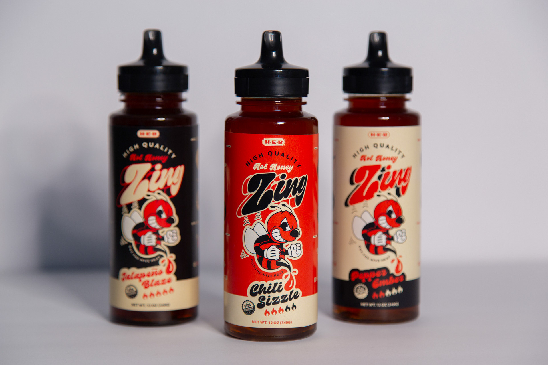
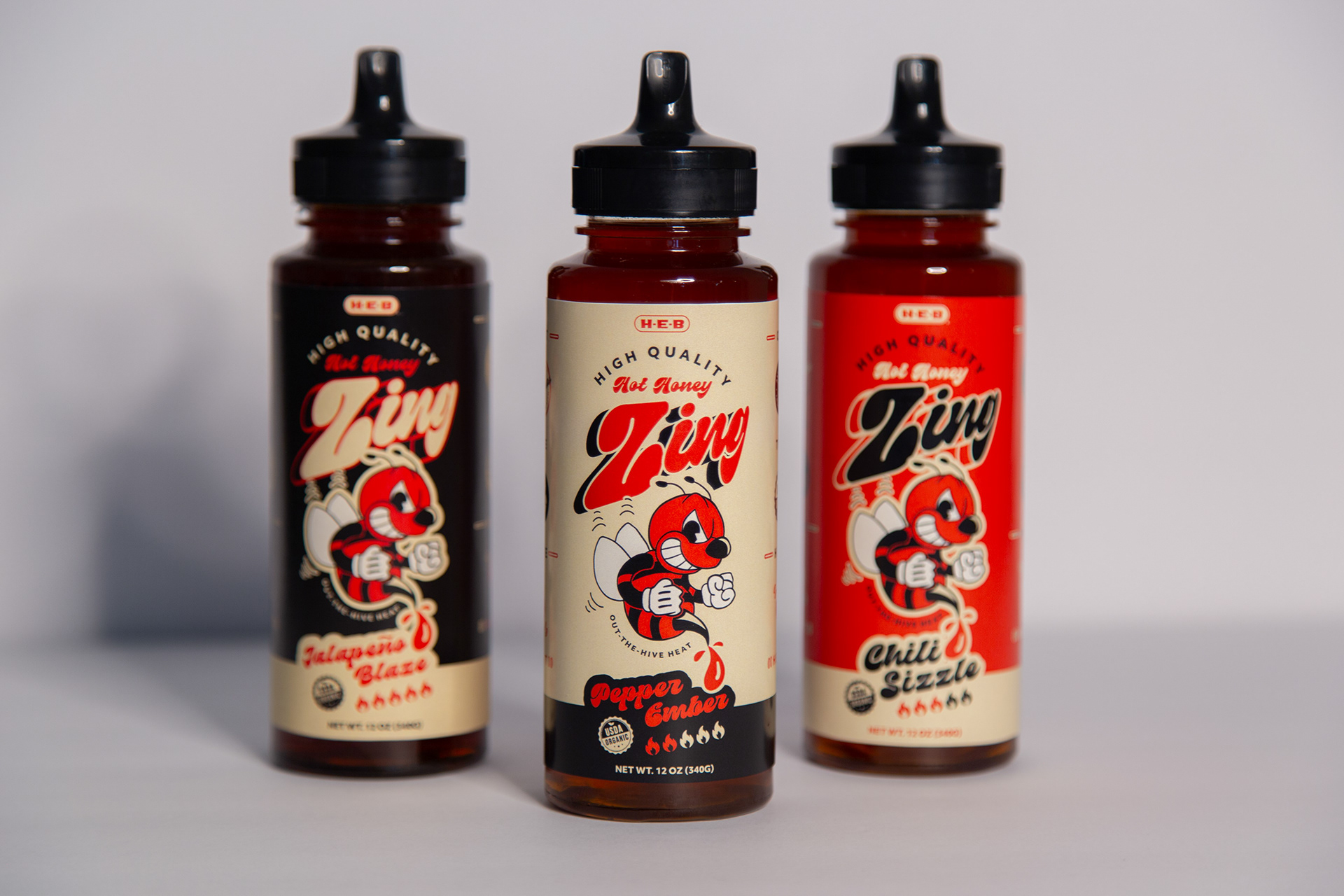
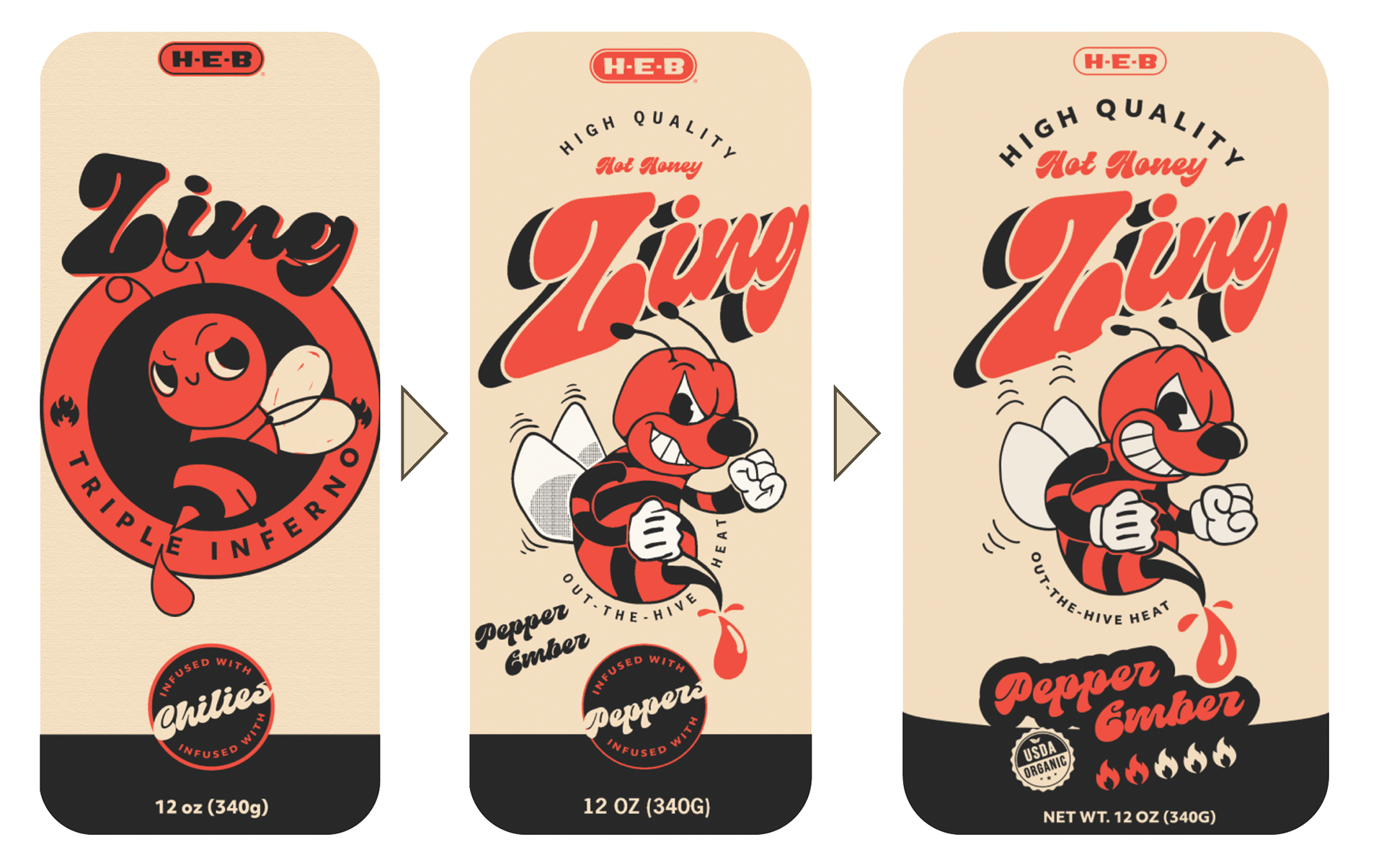
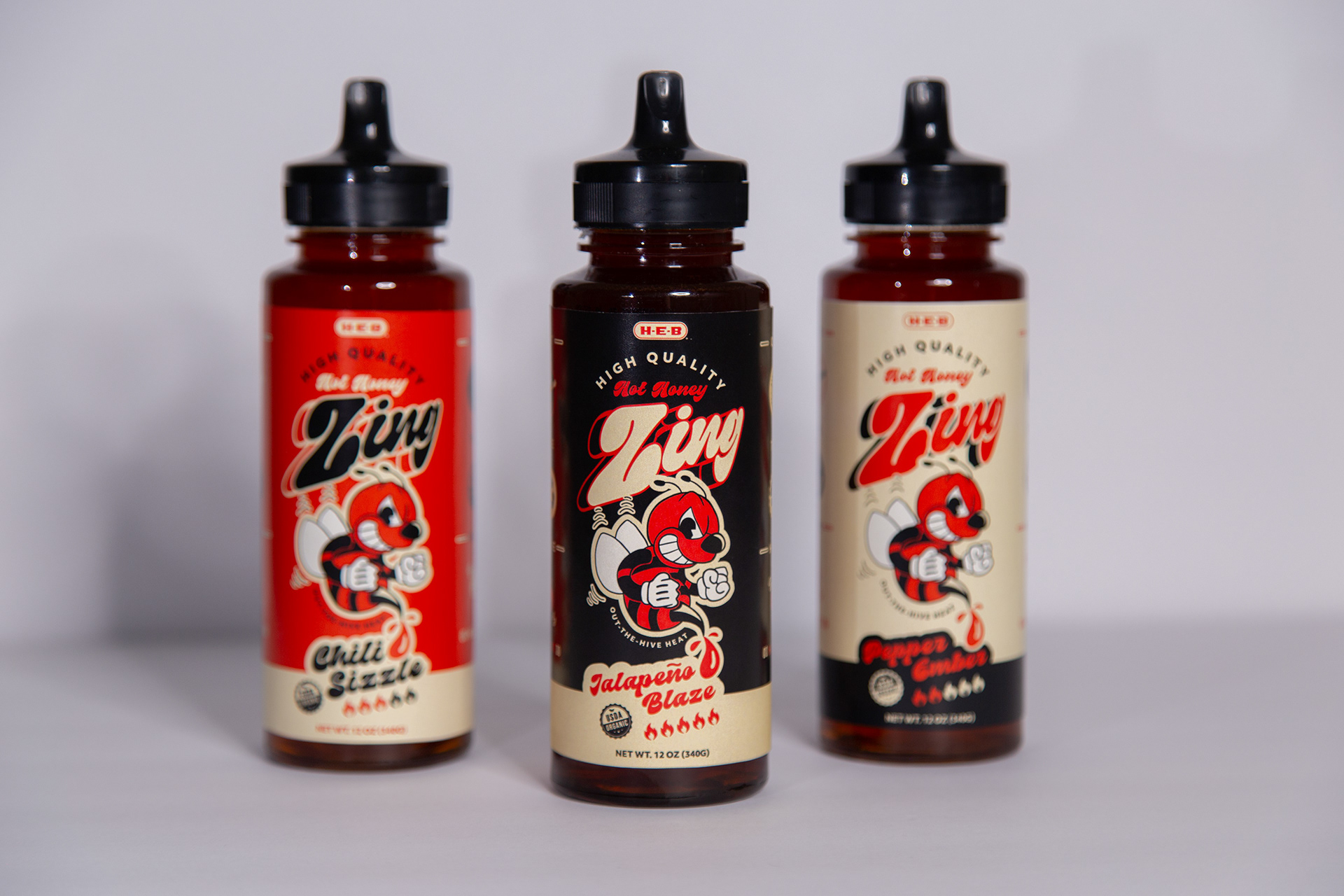
I started my design with the idea of building the product around a bee mascot. Based on the combination of sweet and heat, I wanted the mascot to have an air of attitude in its personality. Initially, the composition was centered in a badge formation, but in order to open it up, I let the mascot stand on its own. The title treatment evolved from just a groovy, in-your-face typeface, to something more-so emulating an old cartoon, similar to the rubber hose illustration style the mascot evolved into. The bright, high-contrast colors are meant to draw eyes to the shelf where most products have a more muted and mundane color scheme.

Process
For the character design, I started with a vague idea of a rubber hose style angry bee. Beginning the vectorizing process, I was able to refine the expression and pose to a more specific visual I was going for, but it still wasn't pushing exactly what it could be. The final iteration of the character integrates more movement and personality that ultimately elevates the final composition to the next level.
Reflection
From start to finish, this design had a core idea in mind: communicate a sense of fun and personality that will attract consumers and compel them to pledge their dollars in a market that has few big ticket competitors. Ultimately, the unique visuals, the typefaces, color combinations, and illustration style, fulfill my objective in realizing the untapped potential of this market.